THE LOGO MUSEUM
A company’s logo is a visual representation of its identity.
It can evoke a sense of familiarity, reliability or modernity.
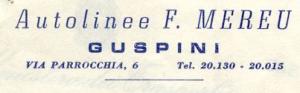
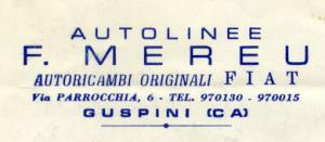
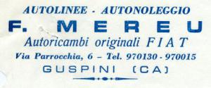
In the case of the Mereu Group, the logo has evolved considerably since 1966, when it was first adopted.
In the early days, the logos affixed to buses were hand-forged metal plates.
These works of art, often made piece by piece by a blacksmith, represented a true statement of intent.
The Mereu Group wanted to convey to its customers the quality and craftsmanship of its services.
Over time, the Mereu Group’s logo has undergone several changes:
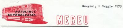
– In 1973, the logo was redesigned for the first time.
The new version was much more modern and dynamic than the previous one; a stylized bus was chosen to characterize the service offered and the color red was used for greater visibility.
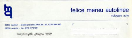
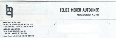
– In 1977, the logo was further reworked.
The new logo was much more minimalist than previous versions.
The logo consisted of an elliptical shape with a stylized letter “M” in the center.
This logo was used for many years and gave the Mereu Group a modern and recognizable identity.
– In 1992, the Mereu Group carried out a major rebranding.
The logo consisted of a geometric shape resembling a wing and a bird, so as to evoke a sense of speed and movement.
The elliptical shape was eliminated.
In fact, the letter “M” was made more angular and modern, and the logo again contained the entire name “Mereu.”
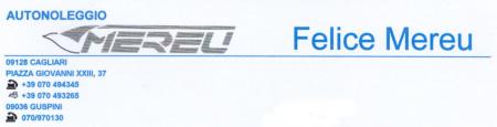
– In 2007, the logo was slightly changed.
In addition, the color of the logo was changed to dark blue.
This change gave the logo greater visibility and a more dynamic feel.
In fact, the shape of the wing was kept, but the colors were reversed.
The logo was now white on a blue background, instead of blue on a white background.
This change gave the logo greater visibility, especially when applied on buses and advertising media.
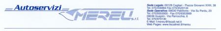
– Finally, in 2022, the Mereu Group carried out another rebranding. The new logo is a modern reworking of the 1992 logo.
The elliptical shape was retained, but the letter “M” was made even more stylized and modern.
In addition, the colors have been replaced in several more modern declinations (gray and khaki, red and white, red and black, and red and gray).
This new logo represents the evolution of the Mereu Group and its continued commitment to providing high-quality services to its customers.
Our Logos
YEAR 1966
YEAR 1969
YEAR 1971
YEAR 1973
YEAR 1977
YEAR 1981
YEAR 1987
YEAR 1992
YEAR 1997
YEAR 2000
YEAR 2007
YEAR 2022
Contact us
+39070 494345
Piazza Giovanni XXIII, 36-37
09128 – Cagliari (Italy)
Email: info@autoservizi.com
Office hours:
Mon: 8:30 a.m. – 1 p.m. | 3:30 p.m. – 7 p.m.
Tue: 8:30 a.m. – 1 p.m. | 3:30 p.m. – 7 p.m.
Wed: 8:30 a.m. – 1 p.m. | 3:30 p.m. – 7 p.m.
Thu: 8:30 a.m. – 1 p.m. | 3:30 p.m. – 7 p.m.
Fri: 8:30 a.m. – 1 p.m. | 3:30 p.m. – 7 p.m.
Sat: delivery and return vehicles by appointment only.
Sun: Closed